
Approximate time to read: 2 minutes.
Symbaroum uses several different typefaces, but none of them are free to use. If you want to create your own content and keep to the theme and feel of the core book, you’ll need to get a little clever with how you marshall your resources.
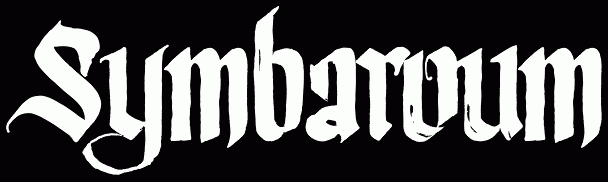
The Ecstasy of Title Text
When I created the English Reference Sheets I wanted to use the typeface that matches the core books titles, but Ecstasy is not a free font. However, if you go to MyFonts.com and view Ecstasy there you can create sample text with the tool at the bottom of the page (the blue button that says ‘Your Text’), right-click the sample created and copy or save it.
Just like that!
Text on the Page
The other fonts I’ve used to create the reference sheets cover the main text and that used in the black header bars. The nearest I could find to the first was News Cycle (on Font Squirrel), which fortunately you can download for free AND can access through Google Fonts. Having News Cycle on Google Fonts mean you can create websites with a certain typeface without needing to own the font or indeed require that all your users own it (otherwise, they wouldn’t see it anyway as browsers normally can only work with what you have stored on your computer).
 Without adjustment News Cycle doesn’t quite look right, so you will need to tweak it. Ideally, you will need to slightly increase the spacing between letters, increase the width of the letters themselves to about 110% and make them a little flatter – about 90% of the standard height. In something like PaintShop you can do this with the Character controls. Online you’ll need to fiddle with the style sheet of the page.
As you can see from the sample the natural setting for News Cycle runs thin and close (on the right). Stretching the width and increasing letter-spacing makes it more like the published font. Compare ‘Dagger’ (a bit of original text taken from the book) and ‘Sanctified’ (added in News Cycle with PhotoShop). It could do with a little more stretch – but the character sheets I’ve been creating have quite limited real estate. You can be a little more generous if you try it yourself.
The nearest I can find for the headers – those shown in brown across much of the book and headers on tables, like in the Equipment section (see page 154 – 155) – is a font called Adamant BG. You might have to roam around for this one using your favourite search engine. All the sites look a bit suspect – you should probably make sure you have up to date antivirus! The site linked to worked for me and I don’t seem to have picked up any malware along the way!
Unfortunately, I can’t find an online version of Adamant BG
Johan Nohr of Järnringen here. Lovely to see such great interest in my field of work (the graphic design and typography) and nicely done with finding free replacements! Although none of them are free typefaces, what we use in Symbaroum are as follows:
Ecstasy by Talavera:
http://www.myfonts.com/fonts/talavera/ecstasy/
Bluebeard by Canada Type
http://www.myfonts.com/fonts/canadatype/bluebeard/
Skolar Latin Pro by Rosetta
http://www.myfonts.com/fonts/rosetta/skolar/
Benton Sans by Font Bureau
http://www.myfonts.com/fonts/fontbureau/benton-sans/
Mikadan by Typodermic
http://www.myfonts.com/fonts/typodermic/mikadan/
And various hand-written fonts for handouts, letters, etc.
Hi,
thanks for the hints to the font files. Could you perhaps also state which font as used for the cover title? Identifont isn’t really helping…
Thanks in advance!
Sure thing. It’s a slightly modified version of the typeface Atreyu by Greg Eckler which is available at a Pay-What-You-Want price here: http://www.losttype.com/font/?name=atreyu
Johan
I use this, becuse is free for personal use: http://www.dafont.com/adlibitum.font
Its quite symilar.
Thanks for the detailed advice!
How did you manage to get the green frame for your reference sheet? It seems to be the original frame for one of the chapters from Symbaroum.
I extracted the raw image from a page of the core book. You can do it with Photoshop or some sites online.
Thanks, thats good to know.
Do you know, if it is allowed to be used in fan-made stuff? Does someone need a special permission?
Hello there.
I’m interested to know if a fankit will be released by Järnringen team or created by a fan and allowed by the team ?
It would be nice for fan made jobs 🙂
You can improvise, as I’ve done. Given that it’s fan-made and free, it doesn’t ave to be perfect. Indeed, it doesn’t really need to be fancy at all if it’s good, solid content!